I was asked by a book arts instructor to bring some of my work that related to the idea of containment in books and boxes and talk to her students about it. This morning I took a full case of assorted pieces that sort of related to the topic and tried to keep myself to the allotted forty-five minutes. It was hard to do because each piece has its story and way of being manipulated and viewed individually. Like this piece above about the fragility of our land…Prayers for the Earth. Collagraphed long pages with added objects and hand stitching. There were several questions about the imagery and objects and format. Sometimes you simply have to say, “I picked what I thought was appropriate and put it together…and I really love how it looks.” What else is there to say.
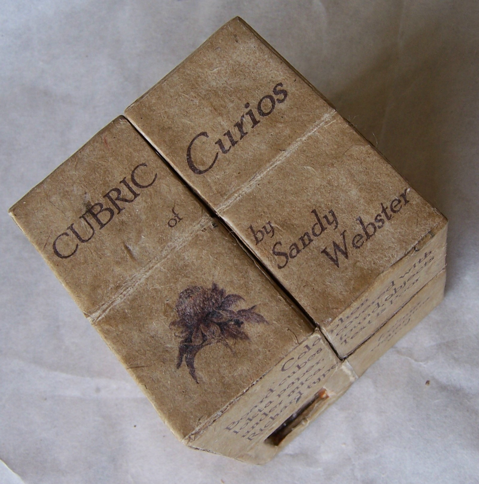
I talked about this one. The shear joy of flipping it open in sequence, reading the text and peering into the mica covered windows at small curiosities.


And this one. A scroll book in a box that maps out a daily walk and measures twelve feet in length. Each stitch in the hand sewn line being the equivalent of ten steps. It is housed in a box marked by the soils and objects picked up along the way and full of small watercolors of what I saw along the walk.
I showed them sketchbooks and we talked about calligraphy. They asked what I thought about calligraphy and I was honest. I don’t much care for the practiced craft of calligraphy. The text becomes too much about how it was put on the page and not what the message is. I told them that whenever I see calligraphy done as it usually is, I feel I have received an invitation to a wedding that I really do not want to go to. It is a personal reaction to all that labor of making letters. And I further said that when I do see the craftsman of calligraphy attempting to make it “artful”, it seems forced. There are few that can move the marks of calligraphy past its own intention of looking lovely. And while I was at it, I added that I thought that too many calligraphers use other peoples writings and it would be good if they could simply come up a few of their own original words and not rely on those of others to make their work interesting.
I didn’t show them this piece from a series called “Folios”. It is my own not so great writing on the left, fragments from journals. And on the right a visual interpretation of some of the message. And of course colored with natural pigments. I suppose for me the work I am looking at just needs to be interesting more than it needs to be correctly and laboriously done.
And I showed them this. A series of three box/books using the text in fragments from an old romance novel to make out a sentence that the viewer can read by following the large marble clunk its way through the maze, bumping off walls toward the finish reading words in a sentence bemoaning “loss”.
And finally I told them about this one. The Proust Pulley. The cut out text, likely from the same romance novel continually flows like Proust’s words themselves. One wonders whether his sentences will ever end. Pasted along the tensioned ribbon it says the following, “I suffer the worst withdrawal that might follow a result of repetition my daydreams have achieved that few small triumphs have tarnished from the trap of self-fulfilling fantasy.”
It doesn’t make much sense but it has the same “woefulness” of the maze books about loss.
I took between fifteen and twenty books with me and left about twice that many home that related to their studies this week about containment. I enjoyed meeting the students and was most appreciative of their interest in my work. But best of all was telling the stories behind each piece and remembering why it was so important for me to make a book about it.


